(Original article by tiffy at Gblog)
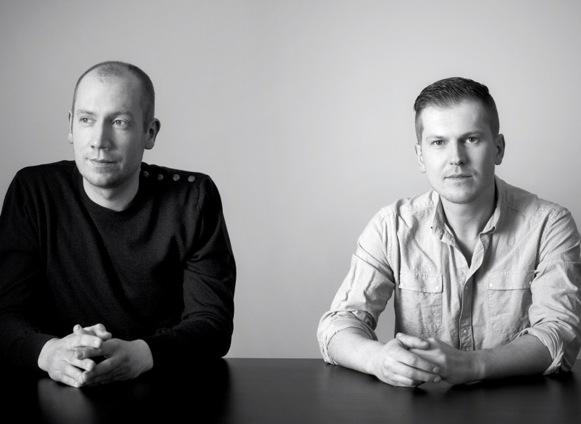
It’s all about the norm with NORM Architects. They excel in creating timeless architecture through their continuous journey of focusing on good design and good ideas. After their whirlwind of innovation first embarked onto this planet only four years ago, Jonas Bjerre-Poulsen and Kasper Ronn have dignified a true presence of the proficiency of what they can do. Jonas Bjerre Poulsen took a breather from gifting the world with their amazing work to chat with us about Verner Panton, Scandinavian design and their personal choice of style.
Your spaces are very “designed,”everything is very clean, minimalist, white and light only leave space to few accents that elegantly complement the environment. How important is it to you the space continuity and the interaction of the space with materials and textures?
We often choose to do bright and white interiors because of its ability to enlarge the space visually. With big windows, the white walls serve as a beautiful canvases for natural daylight and the play of shadows on the walls, when the light enters the house.
White is also an optimal color for the interiors in Scandinavia where the sky is often grey. The white surfaces reflect the light and give a serene feeling that is important to optimize the quality of life in this country, where the sun is often behind grey clouds. These interiors serve as a neutral backdrop. It does not only enlarge the space but provides also the most beautiful and non disturbing background for beautiful furniture, painting and most importantly it takes the focus away from the interior in itself and makes you focus on the life being lived in the house – the colorful people, the colorful food we eat, etc.
A very important issue for us is timelessness, which is a classical virtue in Scandinavian Design. Tendencies they come and go – and they come and go even faster each day – like in the fashion industry, where designers have to come up with new designs for the entire wardrobe four to six times a year. Imagine if that became true for design or even architecture and we had to tear down and rebuild our house several times a year.
The Scandinavian tradition is rooted in a sincere devotion to the crafts, with a strong focus on using good materials, creating designs that last – but products should not only be durable because of good materials and good craftsmanship – but also aesthetically durable in the sense that you can keep on looking at them and still finding them interesting and beautiful over time. This virtue of focusing on quality, durability and timelessness is getting more and more important in a time of scarce resources and mass consumption in a global political sense.
I see a lot of Verner Panton in your work. I feel like his style sometimes can be a little far away from the purity of NORM. Is it an homage to the maestro?
You are right that the colorful Panton universe in many ways is far away from our aesthetics which is mainly due to the retro colors. If you look at many of the designs in themselves they are actually very simple, minimalist and clean – and used in a new context the products also get a new life.
Sometimes I perceive your work as if the space was “suspended in time” waiting for something to happen. One of the Italian maestri I have in my heart is Ettore Sottsass. Ettore was a firm believer that design and architecture are in a way, a compulsive search to “frame” perfection and to make it last forever. Do you believe that it can all be an illusion? Doing so perhaps strong feelings are left aside because are too momentary and ephemeral?
We are very inspired by traditional Japanese architecture in what we do, where there is great emphasis on the beauty of empty space. So instead of focusing on the structural elements of architecture, we focus much more on space itself – what happens between the borders that we define – the event and the possibilities for framing life that architecture provides. In our photographs we try to capture that space or event, which is of course impossible and that is probably why you get that feeling of an event that is about to occur. We are also very focused on the tactility and the poetics of space which in many ways is determined by the tactility of the materials we use. Tactility is, together with all the other senses, extremely important for how we perceive the world.
Tactility may be perceived through our skin and organs, but the expectation of how something will feel is something we constantly judge when seeing. Therefore tactility is also an important part of aesthetics and something we also try to capture in the images of our projects.
Norm is now a world class Firm with its work appreciated in every corner of the Globe. What’s next? Are you exploring something innovative or any new solutions? Do you intend to continue along the line that made you guys come this far or will there be something different in the near future?
As you know, when people mention the word design, they usually think about creativity, originality and uniqueness, but we have named our company “NORM ARCHITECTS” and people often ask us why? We have chosen this name, NORM, because we want to express our wish to work with the traditional Scandinavian norms and standards – already established by a long tradition, instead of rejecting them in the endless search for what is NEW – which before the crisis seemed to be the mantra for many young designers and producers. Instead of focusing on making NEW design, we want to make GOOD design. But of course we try to expand our practice to new areas and work with new elements and genres, as long as it makes sense to us. We engage in everything that interests us – which besides lighting, furniture and architecture also includes graphics, industrial design, photography, art, strategy, art direction, jewellery design and much more. Recently we have also begun to work with how we can use design as an infrastructure to healthy living, trying to influence peoples’ lives in more than an aesthetic and functional sense.
How would you react if someone told you that starting from tomorrow all the human beings of the planet would not be able to see the color white but everything will be shifted to very vivid colors?
We would probably choose another color and continue to work monochromatic with that color. Like the people of Greenland that have more than 80 terms for snow or the Japanse that work with an extremely many shades of grey and brown we also work intensively with color in our projects – just in a more subtle way. We actually love color in nature but we prefer that residential architecture is a true alternative, a calm and controllable universe that gives space for inner reflection.
We know Jonas lived in Roma for a while. I am sure both of you have been to Italy many times. What do you think of the current Italian architecture, generally speaking?
Until recently we actually owned a house in the mountains on the border of Lazio and Abruzzo together with some friends, so we came often to visit. I (Jonas) also have family near Rome. Both Italian and Scandinavian design have always had a certain style that was recognizable, but we now experience that a certain style or design language is no longer determined by national borders. Also in Italy we experience that the design scene is much more diversified than earlier and much more global where designers share ideas related to taste much more than national heritage.
I recently came across the book “Why do architects wear black?” by Corula Rau. What’s in your closet? Name three fashion brands you love and explain why.
As in our approach to architecture, we are also a bit conservative in our choices when it comes to clothing. We have some small independent designers in Copenhagen that we like but when it comes to bigger brands they do it much better across the sound in Sweden and 3 Swedish brands that we love are Acne, J. Lindeberg and Filippa K.


